Barbault & Ganeau Graphs
How They Help Us to Understand Where We Are All Going
A Discovery by Gouchon
In the middle of the 20th century, many astrologers were disappointed because they were unable to predict World War II. However, a relatively unknown French astrologer Henri-Joseph Gouchon came up with an original method for estimating the probability of a major conflict in the world. It was a graph showing the sum of angular distances between the five slow planets: Jupiter, Saturn, Uranus, Neptune, and Pluto. Gouchon had discovered that the lows of this graph show quite reliably the main periods of international crisis.
I created an online interactive app that allows to display such a graph (I called it Barbault graph, and I'll explain in a moment why) for a number of intervals, ranging from 10 to 100 years. Here is such a graph for the period from 1900 to 1960:
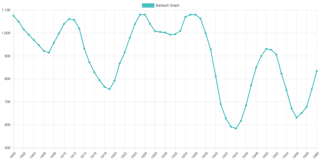
You can see very substantial lows corresponding to the periods of World War I (1914–1918) and World War II (1939–1945). There is also a noticeable dip around the year of the first Russian revolution (1905). So the graph does appear to be quite informative — and it is so simple to calculate! Gouchon's original work was about the unlikeliness of another major war before 1950 or 1951 (despite forecasts from political commentators). Indeed, there was no war in 1946–1949 but as soon as the graph turned down, the Korean War began.
Charles Harvey wrote that what Gouchon managed to discover was a way to quantify the movements of Plato's Great Year. According to Plato, in the beginning of the Great Year all planets were in conjunction, very close to each other, so the angular separation between them was zero, or close to zero. That was the time of chaos, confusion, death and dissolution. In contrast, the highest point of the Great Year, its inhale, so to say, is when the planets are evenly spread around the sky, so the angular separation between them is close to its maximum. That corresponds to optimism, growth and reconstruction in the world. So when the graph goes down, the world approaches the primordial conjunction, when it goes up — the world comes closer to the happy culmination of the Great Year.
Barbault takes over the baton
Unfortunately, despite its obvious value, the oriinal Gouchon's work remained almost completely unnoticed — until it was discovered by a prominent French astrologer Andre Barbault. Barbault realised that this was indeed something he was looking for for so long. He tested the graph thoroughly on earlier periods and came to a conclusion that indeed it shows the main trends of global tension. Not every time the major lows were indicative of a war though. Let's have a look at the second half of the 20th century.
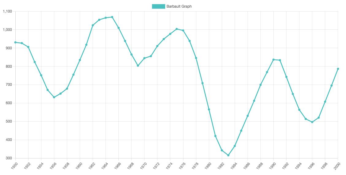
Vietnam War began in 1955, which corresponds to the first dip in the graph. 1968 was the year of a major crisis in Eastern Europe as the troops of the Warsaw Pact invaded Czechoslovakia. The dip in the 1990s saw the Gulf War, then the Yugoslav Wars. However, the very deep low around the year 1983 doesn't seem to correspond to any major international military conflicts. Yes, there was the Soviet-Afghan War, and the invasion of Grenada, and a few other wars, but nothing of the scale that could be expected judging by the depth of the fall of the graph. And yet it was a very dangerous time. I was in the Soviet Army then, and I remember well that stand-off between American Pershing missiles and Soviet Pioneer missiles. Perhaps the dangers associated with nuclear weapons became a restraining factor then. But terrorism grew up significantly during that decade, and it was definitely the time of chaos in the USSR, where three elderly General Secretaries died one after another in close succession.
In the 1990s, I already knew about the Barbault Graph and I looked anxiously at the next major low in it, with its bottom in the years 2021–2022, knowing that it's actually the deepest dip of the 21st century. What's going to be there in the world then, I thought? A war? A major political crisis? And it wasn't only me wondering.
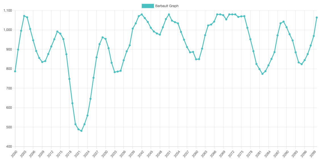
In fact, Andre Barbault himself wrote in 2011 a forecast for the years 2020–2021. A translation of his forecast was published in May/June 2020 issue of the Astrological Journal, the publication of the Astrological Association of Great Britain. Here are some quotations from that translation:
It may well be that we are seriously threatened by a new pandemic in 2020–2021, a period which is at the lowest point in the Cyclic Index for the whole of the 21st century…
However, this configuration can also transfer its dissonant core to the field of geophysical disasters. And, in last place, it wouldn’t spare the world of international business because nature and society would be indiscriminately affected.
And not only that, Barbault also mentioned the possibility of a pandemic in 2020 in his book published in 2014:
It seems that Europe will be at the epicentre of this dissonance, either compelled to reform itself or threatened with division because its space is limited. At least, that’s if there are no natural disasters or a new pandemic which would be suitable substitutes. In any case it will be a time of widespread discord.
Looks like Barbault Graph has proven its usefulness and its value once again. But isn't it a little bit depressing to feel ourselves living at the bottom, like we are now? Well, there is something that could help us to improve our moods: it's the Ganeau Graph!
Further Development by Ganeau
Barbault wrote about the graph (he called it the "Cyclical Index") in his book and magazine, and he stimulated his colleagues to further exploration along the same lines. The version of the graph developed by Claude Ganeau is especially interesting. When summing the angular distances between the pairs of planets, Ganeau took into account which of the cycles were in the waxing, outgoing phase, and which were in the waning, incoming phase. He called his version of the Graph "The Index of Cyclic Equilibrium", and its values can be above zero when the waxing cycles dominate, or below zero when there are more of the waning cycles. Here is what the Ganeau Graph for the 20th century looks like. If you wish to have a closer look at some of the periods, you are welcome to use the online interactive graph.
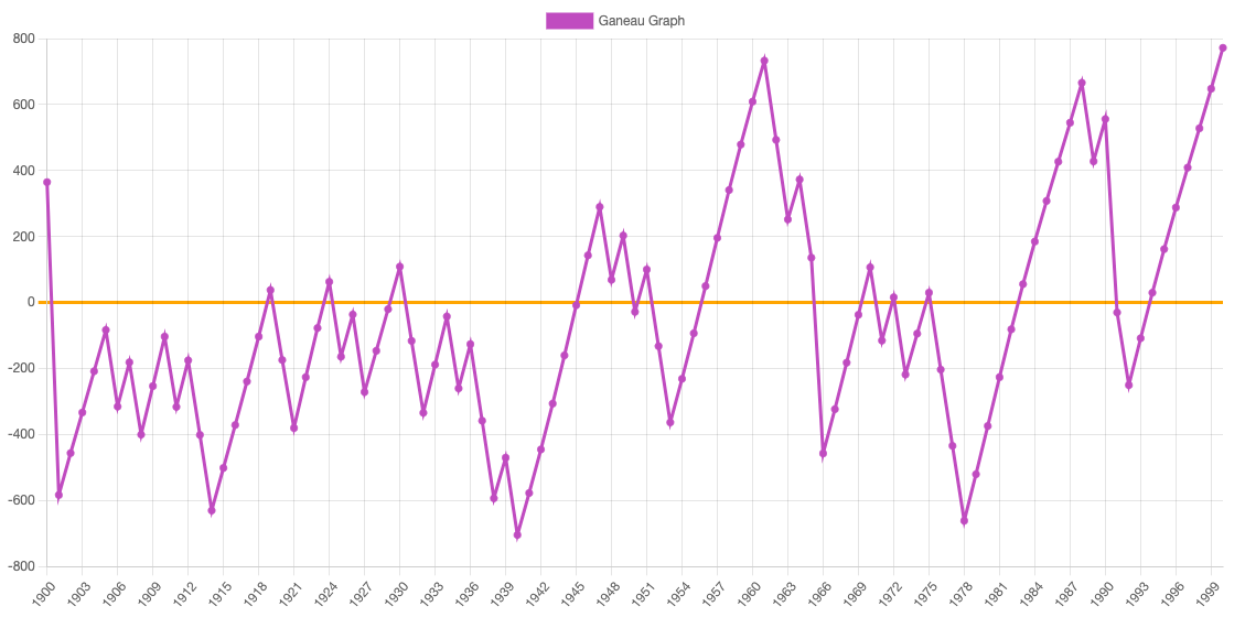
To help us understand what this graph tells us, Ganeau has proposed a "Law of the Rhythms of Time", which says:
The stability or instability of the world is directly related to the difference in the sum of the phases of all waxing cycles of the five outer planets, and the sum of the phases of waning cycles of planets. Whilst the resultant figure remains positive, the earth will tend to experience relative stability and a period of evolution; when the resultant figure is negative the earth enters a period of crisis and involution.
Notice that there were only a few brief periods of stability and evolution in the first half of the 20th century. But there were two World Wars then. One of the highest peaks of the graph, on the other hand, corresponds to the years of Perestroika, 1985–1990. The earlier, still higher peak, from the middle of the 1950s to the middle of the 1960s is strongly associated, in my understanding, with the so-called Khrushchev's Thaw. Stalin died in 1953, and when Khrushchev came to power, he tried to undo many bad things inherited from Stalin — at least those that could be undone. So that decade was quite positive and optimistic. And how about our times?
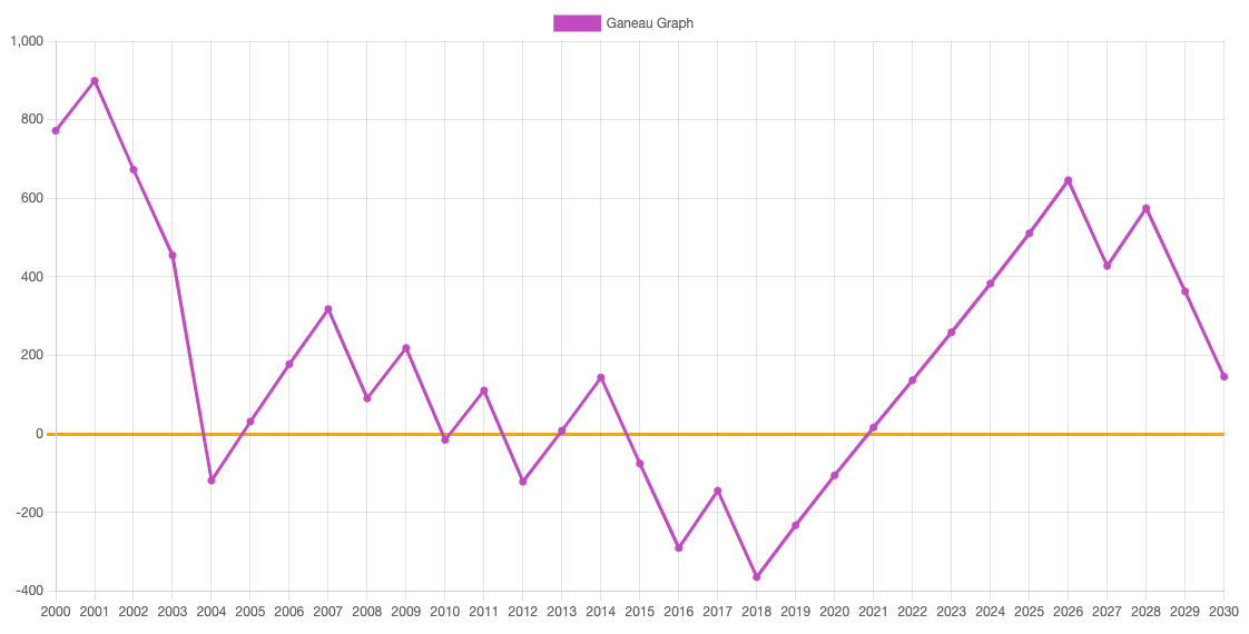
As you can see, we've just spent several years on the side of crisis and involution, but in the year 2021 we've crossed the zero line heading up. And now we are already on the stability and evolution side. Isn't it a good reason for optimism? I believe it is.
As for my understanding of what these graphs show to us, what's the difference between the Barbault one and the Ganeau one, I imagine that our world is a heavy train with great inertia. If it slows down, it isn't so easy to accelerate again. This train, its movement, is described by the Barbault graph. The driving force of the train is the locomotive. The train responds to the efforts of the locomotive — although, perhaps, not immediately. The locomotive may already start working on acceleration, but the inertia of the train will cause some delay between the beginning of the acceleration efforts and the actual acceleration. You already understood that the locomotive in this metaphor is described by the Ganeau graph. The locomotive is the initiative groups among the human masses, those people who are working for the better future. And now that the Ganeu graph is on the positive side, the forces of light are beginning to win, even though the world is so close to the primordial chaos.